Apple Music on Android is every bit as good as it is on iOS
Cross platform tuneage

Apple Music has been on Android for a while now, and it’s now on par with its iOS counterpart.
When Apple acquired Beats Music as part of its takeover of Beats, the service went away and was replaced by Apple Music. Windows is still out in the cold, but Apple surprised us by creating an Apple Music app for its main competitor, Android.
Apple Music on Android has, until very recently, had its own identity that fit in with the platform it calls home. Recent updates have brought it into line with what you’ll find on iOS, so it’s time we took a fresh look at it from across the mobile nations (see what I did there?) and see what it looks like from an Android user’s perspective.
Almost identical siblings

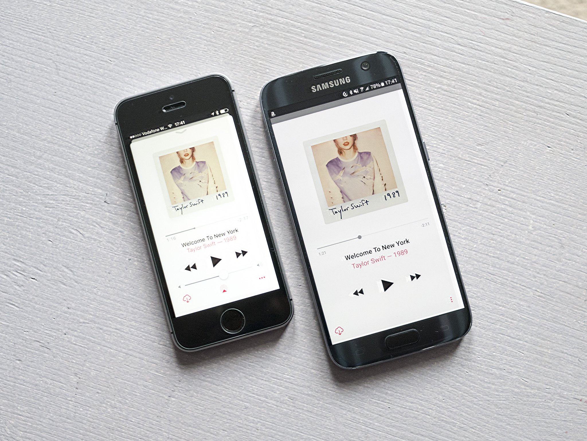
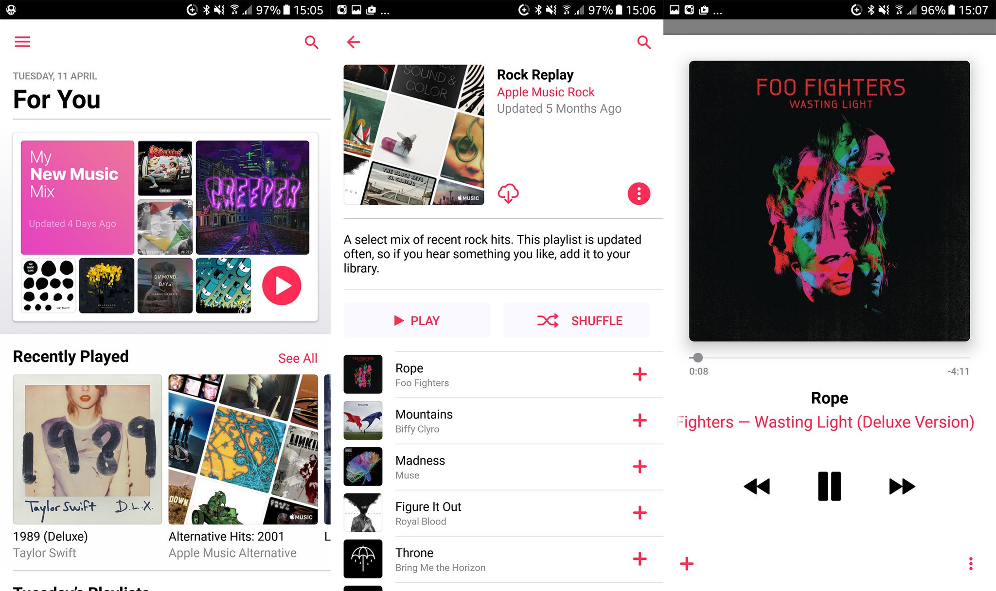
Apple Music on Android has had a visual overhaul which brings it straight into line with the iOS version. So we’re looking at a lot of white, some red accents, and very bold headers. The biggest visual difference is in where you find the navigation bar — Android prefers a hamburger menu over Apple’s static bar running across the bottom, so your app sections are tucked away on Android.
If anything, hiding that stuff actually makes the Android app look a little better. It’s a little cleaner, with no additional on-screen clutter. Everything you need is always just a swipe away.
Lyrics for your songs are present and correct. Just scroll down in the player and you’ll see an option to show them if you want to sing/rap/shout along.
Aside from font differences and the placement of things like the volume bar, the two apps are about as identical as you could hope for. Apple has…
